
On this page · 5 sections
Agent systems produce a lot of visible activity: tool calls, intermediate messages, retries, token counts, scores, partial outputs. It is tempting to put all of it on a screen and call the screen observability. A better test for an agent dashboard is narrower: someone with fifteen minutes and four waiting runs should be able to work out which one needs them and what to do about it, without opening a second tab.
What is the operator actually deciding?
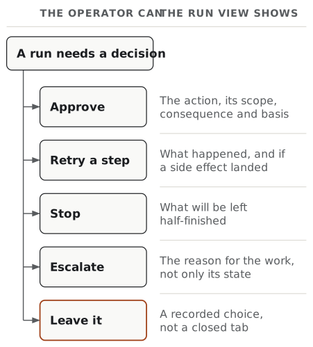
Start from the decision rather than the data. In practice an operator looking at a run has only five options.
They can approve something the run has proposed and is waiting on. They can retry a bounded part of it, which is a different act from restarting, and carries different risk. They can stop the run, either because the goal has changed or because it is doing something unhelpful. They can escalate, handing the run to someone with more authority, more context, or the ability to make an exception. Or they can leave it, which is the correct answer more often than most interfaces admit, and which needs to be a visible, recorded choice rather than the result of closing the tab.
Each of those needs different information. Approval needs the proposed action, its scope, its consequence, and what the agent based it on; that is a workflow in its own right, and human approval workflows for AI agents covers the design. Retry needs to know what already happened, because a side effect that may or may not have landed is not a clean starting point. Escalation needs a handoff that carries the reason for the work, not just its state. Stopping needs to know what will be left half-finished.
So if your run view shows the same fields whatever decision is pending, it was designed around the display instead of the decision. A run waiting on approval and a run that failed twice on the same tool should not look alike.
Where a trace and a dashboard part company
Both are useful, and they answer different questions for different readers.
| Trace | Run view | |
|---|---|---|
| Question it answers | What happened, in order? | What should I do about this? |
| Reader | Whoever is debugging, after the fact | Whoever is on duty, now |
| Unit | A span or an event | A run, and its current state |
| Completeness | As complete as you can afford | Deliberately partial, with depth on request |
| Ordering | Chronological | By what needs attention |
| Good failure mode | Too much detail | Too little, recoverable by clicking |
It is tempting to build the trace first, because it is mechanical, and then add filters until it becomes a dashboard. That path tends to produce a chronological list with a search box, which leaves the operator to do the triage the interface was supposed to do.
The two also break a run down differently. API-Bank (Li et al., EMNLP 2023) built its evaluation around the observation that planning, retrieval and execution fail independently in tool-using systems. A trace shows all three interleaved. A run view has to say which of them went wrong, because the answer determines whether the right move is a retry, a rewrite of a tool description, or a stop.
Evaluation practice says the same about single runs. τ-bench (Yao et al., ICLR 2025) measures reliability with pass^k over repeated runs of the same task, because one successful run is weak evidence in a multi-turn, policy-constrained setting. An operator looking at run 47 of a nightly job is in the same position: the useful comparison is often between this run and the other forty-six.
A run view, sketched
Below is a generic sketch of the fields a run view can carry. It describes no product and names no vendor.
RUN  reconcile-payments / 2026-09-19 06:02  ·  run 47 of a nightly job

OUTCOME     Stopped, awaiting a person
            Blocked at step 4 of 6 after two failed attempts on the same call.

GOAL        Match 214 unreferenced payments to open invoices.

CHANGED     12 invoices marked paid  (irreversible, customer-visible)
            0 emails sent
            2 records locked, released on stop

WHY         `match_invoice` returned 409 account_not_eligible twice for
            account A-8841. The error is classed do-not-retry.

EVIDENCE    Step 4 inputs and response  →
            The 12 completed matches    →
            Runs 44-46 hit the same error on the same account  →

NOW         [ Skip this account and continue ]   bounded, resumes at step 4
            [ Retry step 4 ]                     blocked: error is do-not-retry
            [ Stop the run ]                     releases 2 locks, keeps 12 matches
            [ Escalate to billing ]              carries goal, step 4, and evidence
            [ Leave it ]                         records that you looked

CONTEXT     Third consecutive night with this error.
            Triggered by: schedule.  Authorised scope: invoices:write (read-only on accounts).
Six things about that sketch matter. The outcome is written as a sentence, not shown as a status colour. What changed in the world is separated from what the agent attempted, and irreversibility is marked. The reason is specific enough to act on and names the error class, because a do-not-retry error and a transient one call for opposite moves. Evidence is one click away rather than inline. Every action states its consequence, and one is disabled with a reason rather than hidden. And the run is placed in its history, because three nights in a row is a different problem from once.
Some things are left out on purpose: token counts, latency percentiles, the model version, the full tool sequence. All of that belongs in the system, but none of it helps with the pending decision.
From logging to decision support
What separates a log from a decision-support view is whether the reader has to do the interpretation.
Three habits help. Name the outcome in the words of the job. “Stopped, awaiting a person” is usable. state=HALTED_4 is a lookup. Attach the consequence to the action, so that clicking retry does not require the operator to remember what step 4 touched. And let the view distinguish a first occurrence from a pattern, because the useful response to a recurring failure is usually a product change rather than an operational one.
Two constraints go with this. Not everything worth recording is safe to display. The NIST AI Risk Management Framework frames trustworthy systems as balancing accountability and transparency against security and privacy in context, rather than maximising any one of them, so a richer run view is not automatically a better one. Redact at write time rather than at read time, since a run record containing a customer’s payment details is a liability whoever can currently see it.
Escalation deserves the same care as approval. A run handed to a second person with nothing but an error string arrives as a puzzle instead of a task. Where the escalation also widens what the agent may do, that is a change of authority, and standards exist for it: OAuth’s step-up authentication challenge (RFC 9470) addresses exactly the case where an in-progress session’s authentication level is insufficient for what is now being asked.
The worked example on timeout recovery shows the retry half of this in a synthetic case: an uncertain timeout is product history, and the correct move is to verify state before repeating a side effect. If the run view cannot show that distinction, operators learn to retry by reflex.
Frequently asked questions
What should an agent observability dashboard show? It should show the runs that need a person, each with a stated outcome, the reason it stopped where it did, the evidence behind that reason, and the actions available right now. Everything else belongs one click deeper. A view that opens on a chronological list of every event makes the operator do the triage that the interface was built to do.
How is an agent dashboard different from a trace viewer? A trace answers what happened, step by step, and is indispensable once you already know which run is interesting. A dashboard answers which run is interesting and what to do about it. They have different readers, different time budgets and different failure modes, and collapsing them usually produces a trace viewer with a filter bar.
What decisions does an operator actually make about an agent run? In most systems the set is small: approve a proposed action, retry a bounded step, stop the run, or escalate it to someone with more authority or context. Doing nothing is a fifth and legitimate option. Designing the view around those five choices is more useful than designing it around the data you happen to emit.
Should an agent dashboard show every tool call? Not on the first screen. Tool calls are evidence for a decision rather than the decision itself, and a system that emits hundreds of them per run will bury the one that matters. Keep the full sequence available, summarise it by outcome, and lead with what changed in the world rather than what the agent tried.
A good test for a run view is how long it takes a tired person to decide, and how often they decide correctly.